Typography is an inherently connecting art form serving as a bridge between an author and a viewer. However, much of today's use of typography is intended for quick consumption meant to match a shortened attention span, enabling transient behaviors of communication and interaction.
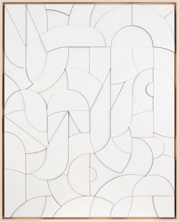
While my work is largely informed by typography, its aim is to reconsider the relationship between message and viewer. I believe a message is not about reading, but finding meaning. In these works, letterforms are abstracted and reconstructed creating a space for the viewer to more intentionally engage with a message through alternate means of form, color, sentiment, exploration, and introspection in the hope of creating a deeper personal connection.
In most instances, the works follow a traditional western structure moving left to right, using the title to inform the architecture and layout found throughout the piece. The integrity of the letter's gestures are maintained in the work but become abstracted as they take on different scales, overlap on top of one another, and become segmented & color-blocked until ultimately filling the space entirely offering the title in a reconsidered visual language.
The ideas and sentiments found within the titles are distillations that stem from reflections on personal and cultural events. In that process, I am attempting to mine for emotional clarity to complex or nuanced situations. In their final state, the titles regularly exclude pronouns like 'I, me' or 'we' intended to communicate from a more universal perspective, encouraging the viewer to bring their own associations and contexts into the viewing experience as these themes tend to be a part of the larger human experience.
- Scott Albrecht
 Scott Albrecht, Searching for the Shadow of the Sun, 2023